Headwaters Council Member Makes Her “Mark” on TFT

Michelle Mark’s branding studio, Morning Assembly, was born from an ethos of simply saying “yes” to work. Starting with logos for friends, websites for small businesses, and evolving her craft into working with some of the most visible brands in Portland, she has over a decade of experience translating business visions into visual identities.
After almost a full year of design and review, Mark launched the newly refreshed brand identity for The Freshwater Trust (TFT) this past month, and we couldn’t be prouder of the result. Mark took into account our decade old logo, paired with audience research, current messaging and future vision, to develop the full brand package that will carry us through the next decade. To read more about our new brand, check out this post.
In addition to Mark’s invaluable contribution to the future face of TFT, she’s also been a Headwaters Council member for nearly two years, helping us raise funds and friends, and engaging in conversations concerning the strategic direction of the organization. We were happy to pass the mic to her for a conversation about her work, what inspires her about TFT, and an insider’s look into our new brand.
Where are you from?
I grew up in Southwest Portland with my mom, dad and three younger siblings. My mom is a professional artist, so I was exposed to art at a really early age. We were NEVER allowed to say we were bored. She had her studio in our home, and we could try any kind of art project we could think up. I always went over the top when it came to class projects, report covers, Halloween costumes, any excuse to create.
Is the rest of your family creative?
Oh. In a big way. Everyone is really creative in their own ways.
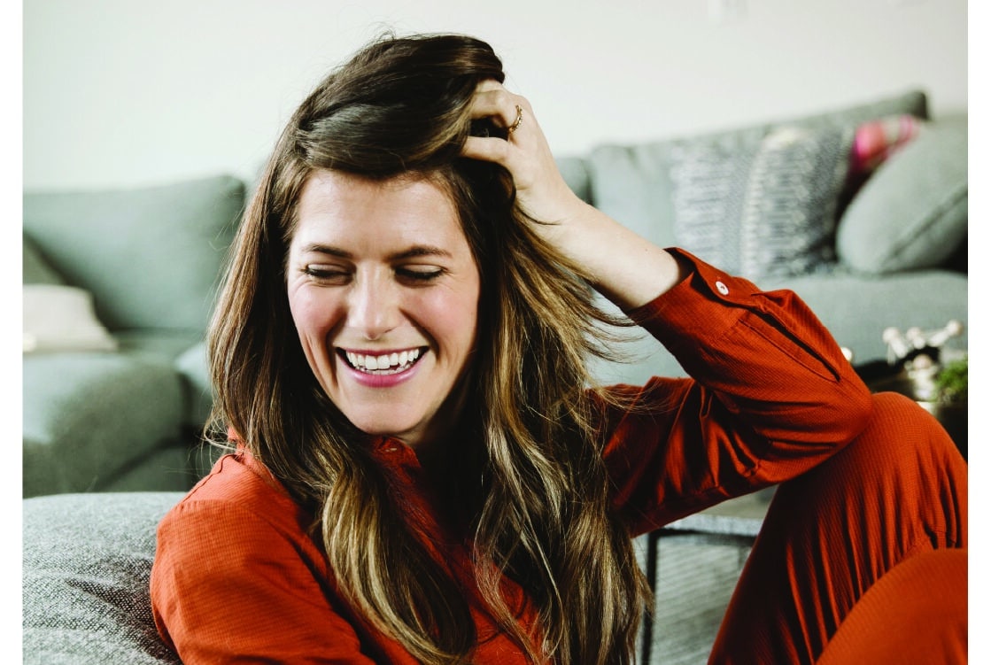
Michelle Mark is the one-woman team behind Morning Assembly.
What is “good design” to you?
I’ll quote the outstanding Saul Bass who said it best: “Design is thinking made visual.” To me, it’s creating a visual language that tells a story and communicates beyond the constraints of words. Being able to clarify what we already know to be true.
What are some of the things you aim for in your designs?
I aim for timelessness. I work to veer away from anything that will get out of date quickly. I want to create longevity when it comes to branding to create a visual language that feels sophisticated and could function in any era.
What are you currently inspired by?
Whether I am out for a walk or wandering through a store or museum, I’m constantly collecting ideas for projects. The ideas come from everywhere. My office shelves are full of typography and art history books, Illustrators Annuals, typewriters, and a storied matchbook collection from the past hundred years.
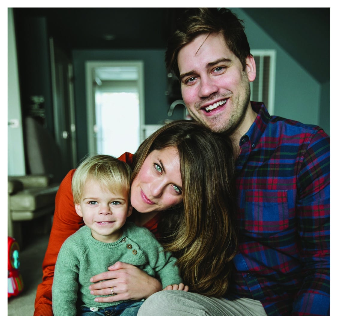
Michelle and her family.
What had you initially interested in TFT?
I first got interested when a lot of news coverage revolved around California going through their water crisis. The idea of water scarcity is terrifying to me. The idea that clean water may not be available. I think growing up in Oregon and being spoiled by its abundance had something to do with it. Also, knowing the reality that this could change within my son’s lifetime was really scary. So, I decided that I needed to learn more about it and find a way to get involved. I’m clearly not a scientist, but I have learned so much through this organization. Quantified Conservation is such a differentiator. TFT’s work doesn’t just feel like a Band-Aid but like it is changing the trajectory of how our rivers are actually fixed.
What was the biggest challenge of this project?
It was fairly challenging to come up with something simple that also represented the complex nature of TFT’s work. I was inspired by all the different work that they do. They also needed something that was different and fresh but not necessarily a complete departure from the previous identity. They knew that they weren’t the same organization that they were 10 years ago and won’t be five to 10 years from now, but the goal is to create an identity that will speak to the fundamental values and character of the organization.
What inspired the final result?
I was first inspired by the amorphous shapes of the basins. I also wanted to give a nod to the curves, flexibility, and fluidity of a river and the imperfection of nature as a whole. The mark is topographically inspired and meant to showcase a connection to the land as well, which is where TFT does a significant amount of their work in order to yield results for rivers.
The goal is also to elicit feelings of interconnectedness. That says a lot about water and also about TFT. By its nature, water ties us to one another. Different regions are connected by it. All sectors rely on it. All humans need it. TFT’s innovative solutions reflect the interconnected nature of water. The “how” of what they do, and how they are changing the systems by which rivers are fixed, involves many different facets of society that control and have the ability to make a difference for water.
Finally, strength was a big one. I was of course aiming for something fluid and organic, but also something that would represent the strength of the people and organization, its bold solutions and the power of water itself.
What do you hope this new logo and branding does for TFT?
It should more accurately reflect the current organization and give a nod to where it’s going. The organization was due for a refresh to reflect its strength and values, and also to provide more flexibility in its use. I also hope that it catches the eye of new audiences and inspires them to learn more about TFT and invest in its mission.
And also, in a way, I want TFT’s current audience to look at it and not feel like it is a total departure. My goal is to always create something that feels connected to an organization’s past and present, as well as the future.
What’s the sharpest tool you keep in your toolbox?
Listening. Especially in the early stages of a project, when so many clients don’t know exactly what they want or need. Focused research and listening has helped give me invaluable insights into what would benefit my clients. With TFT, I was able to be in the room throughout the process to watch reactions, write down words that were frequently used, and experience the tremendous work firsthand through on-site visits.
See Michelle’s work for Oregon State Parks, Melvin Mark Co., Pepe le Moko and numerous other organizations you’ve likely encountered here.
October 22, 2020#brand #branding #design #headwaters council #logo #partnership #q&a #question and answer
Enjoying Streamside?
This is a space of insight and commentary on how people, business, data and technology shape and impact the world of water. Subscribe and stay up-to-date.
Subscribe- Year in Review: 2023 Highlights
By Ben Wyatt - Report: Leveraging Analytics & Funding for Restoration
By Joe Whitworth - Report: Transparency & Transformational Change
By Joe Whitworth - On-the-Ground Action – Made Possible By You
By Haley Walker - A Report Representing Momentum
By Joe Whitworth